A Guide to Heuristic Website Reviews

Consider this, you navigate into a website, and you are instantly met with a bad feeling.
Maybe it feels spammy, or fake.
Perhaps you realise the URL is spelt similarly to what you were looking for, but it’s quite not right.
Popups could cover the page, the imagery may look poor, or the site has never been optimised to fit your screen.
If you use the web, you are a website reviewer, constantly making assumptions in seconds based on what’s in front of you.
So, making sure your website stacks up to expectations is crucial.
In this blog, I’ll take you through heuristic website reviews, what they are and how to conduct one for a top performing website.
What Are Heuristic Website Reviews?
Heuristic means “enabling someone to discover or learn something for themselves”.
In psychology, heuristics are shortcuts that simplify the decision-making process. In UX, heuristics are guidelines that can help you make decisions about a website – even if it is not quantifiable.
When we conduct heuristic website reviews, a good starting point is Jakob Nielson’s 10 Usability Heuristics for User Interface Design.
These 10 examples are great guidelines, however, are not an end all be all.
In some cases, they may not be applicable to the website or web app you are developing or designing. In others, you may choose to take a different approach than what is defined here due to customer research.
Jakob Neilson’s 10 Usability Heuristics for User Interface Design
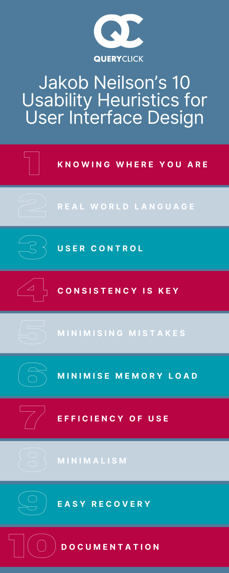
- Knowing Where You Are: Imagine you are taking a quiz or completing a course. Most likely, you will want to see how many questions you have answered and how many are left to go. This information can be extremely useful for customers – increasing the chances of them getting through all of the stages ahead of them.
- Real World Language: When we create a website for a particular audience, we need to make sure we are speaking their language. The words used should be familiar, the iconography should be based on their real-world experiences and there shouldn’t be a time where the user would have to look up the meaning of words on the page.
- User Control: Wrong turns can easily happen online. Making sure there is a clear, and direct way for the user to get back to where they want to be is key. We also want to allow them the freedom to explore more areas of the site – without getting lost and frustrated because they cannot easily get back.
- Consistency is Key: Most people respond well to familiarity. Consistency amongst the industry standards or other websites and web apps that are like yours is important. Users will know how to navigate something familiar. Consistency in your own website is possibly more important. This includes language, fonts, and colours.
- Minimising Mistakes: Careful design to minimise errors will make for a much better experience. Instead of directing your users to a generic 404 page, substitute it for an option that will allow them to continue their journey. Perhaps that’s offering your latest products or a clear CTA that will take them back to where they were before.
- Minimise Memory Load: Recognising information that is consistent across the site will reduce the effort needed for someone to continue their journey. Let users recognize information across the site instead of having to dig through their memory to identify the meaning.
- Efficiency of Use: Keyboard shortcuts are a great example of efficient ways to use a UI. If your project allows for it, personalisation, customisation, and accelerators will make for a unique and stronger user experience – allowing your users to choose which option is best for them.
- Minimalism: Websites that are cluttered and clunky can easily distract people from what is really important. This isn’t to say “stay away from colours” – it just means that you need to make sure your key CTAs and pathways are easily found and not competing for attention.
- Easy Recovery: Error messages can be confusing for many website users. We need to make sure that when our user does hit an error or a dead end, they are offered a solution and not just messaging that makes no sense to them.
- Documentation: When we need more information, we need to be able to retrieve it easily. Providing the right information at the right time is ideal. However, if a user needs to search for it, make sure your search functionality is easy to navigate and provides the correct solutions.
3 Steps to Take After Conducting a Heuristic Website Review
Now that you have your evaluation, we need to make sense of it.
These valuable insights and understanding of users’ needs and pain points will help you set up your tests.
There are many routes you can follow, and it is up to you to decide what is most applicable to your situation.
5 Second Tests
Gather users and give them 5 seconds to browse the information on the page in question.
After that ask them a series of questions including what they saw, what stood out to them, and other important questions related to your research.
A/B Testing
Create an A/B test based on your findings. Let one group experience the new version while the other half will stay on the controlled site with no changes. Compare the behaviour of each group to see if your hypothesis was met with good results.
AI Behaviour
If you do not currently have access to a large number of users, AI gaze plots, eye tracking and opacity maps may be exactly what you need.
This information could be used to back up your predictions and help you with your UX journey.
QueryClick CRO & UX Audits
At QueryClick, we have a team of experts ready to kick start your CRO & UX journeys. Find out more about our web optimisation services here, or click the button below to book a chat with our team.
Looking for a CRO partner?
Chat to us today about how QueryClick can help drive more conversions through your website.
Featured Content
-

SEO migrations occur for several reasons, including migrating to a new CMS or migrating URLs...

Own your marketing data & simplify your tech stack.
Have you read?
Chrome’s announcement on dropping cookie opt-in last month closed the door on a 5 year saga for marketers. But what is the landscape like in 2025 for cookie-based measurement?

Generative AI is transforming the way that marketers plan and assemble content for their Paid Ads. As big platforms like Google, Meta and TikTok increasingly build the tools needed to...

In a surprising move that has sparked heated debate, Mark Zuckerberg announced on his Instagram that Meta will be reducing its levels of censorship and in particular fact-checking on its...