Visualising AdWords Data Using ‘R’

Having worked with AdWords reports and metrics for the best part of the past decade, I’m always keen for fresh ways to try and get a better understanding of the data and what it means in terms of performance. Recently, I’ve been using the ‘R’ language for various purposes, one of which has been exploring more interesting ways to look at PPC numbers.
About R
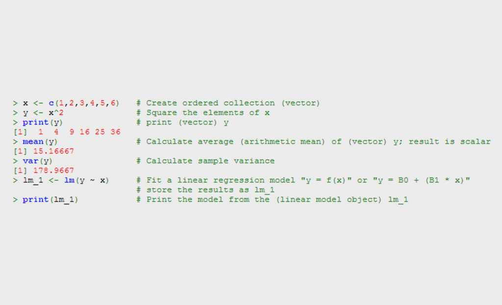
R is a programming language and a set of related software environments designed for statistical computing and graphic generation. Generally speaking, R is used via a command-line interpreter, so has a reasonably steep learning curve (compared to, say, Excel):
That said, given it is an open-source project and is growing in popularity (which equals a healthy online community), there are some great resources to help you get started. (For example Code School, Coursera’s‘Computing for Data Analysis’ course and Quick R to name but a few).
Why Not Excel?
There is quite a number of functions within R that can be easily achieved within Excel, without needing to invest time learning a new language. Commonly cited reasons for choosing R in many situations are:
- It’s easier to reproduce analysis for numerous data sets (thanks to the use of scripts)
- You can import data from more sources (for example, it’s easy to scrape data from the web directly into R, and there are ready-made packages for importing the likes of Google Analytics or Omniture data)
- The workflow is more suited to ‘exploring data’
This last reason is key for me. I find it much easier to manipulate data, create visuals and model things such as forecasts using R.
Why ‘Visualise’ the Data?
Statistical visualisations make it easier to draw conclusions about important relationships within data sets. When faced with a series of columns containing data, it can be hard to understand how each piece relates to all the others, but plotting the information in a relevant form can draw focus and help understand what is going on. Good visualisation should ‘reveal’ something about the data.
The recent popularity of infographics can be used as an example of how much easier interestingly presented data can be digested.
When an engineer at facebook wanted to understand the geographic relationship of over 500 million members, this was achieved by creating a visualisation using R:

Plotting AdWords Data: Examples
Now that I’ve set the bar high with the above, über-sophisticated graphic, it’s time to lower it by sharing some of my own practical examples. As part of learning to use the language, I thought it would be interesting to apply some of the charting techniques, with the aim of creating graphics which would help me understand the AdWords better, allowing further optimisations of the account. I wanted to share these to illustrate the possibilities.
Note:the graphics below are the result of a few lines of between 5 and 20 lines of code, but for now I will leave this out (as that’s for another time) but this gives an indication of how simple this can be.
Campaign: Keyword Cost vs. Revenue
Something R makes incredibly easy is creating charts split by factors or ‘facets’. The image below represents cost vs. revenue of keywords, split by month. The green line represents where revenue = cost, so anything over this line is in positive ROI. The blue line represents the overall relationship between revenue and cost (the steeper the slope, the higher the ration of revenue to cost)
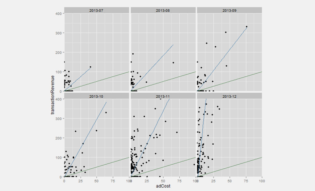
This helps me to understand that whilst the number of keywords with adverts increased, so too did the profitability increase (so the campaign scaled without regressing in profitability).
Campaign Boxplot
One of my favourite descriptive charts is the boxplot, explained below:
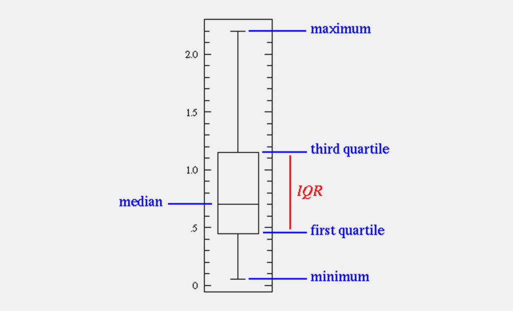
Whereas the most common charts we see are totals or aggregates (for example, most views in Google Analytics), the boxplot conveys the full range of characteristics of the data.
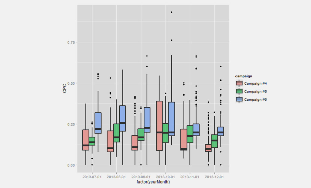
This chart compares three campaigns over a six month period, giving me a clear understanding:
Conversion Path Relationships
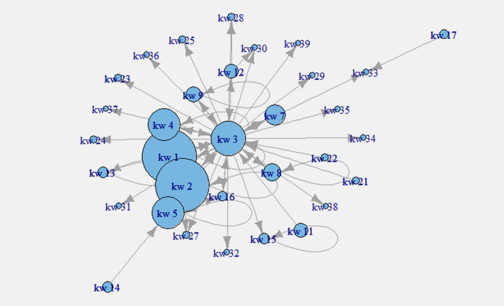
Taking the keyword conversion path reports in Google Analytics (explained here) as the input data, R was used to create a network graph of the keywords, which was then visualised below. To explain the chart a little, each node represents a keyword used in the conversion path, and the directional arrows the relationship. For example, ‘keyword 33’ converted twice, with preceding keywords in the path including ‘keywords 17’ and ‘keyword 7’:
Conclusion
Hopefully I’ve managed to convey how useful data visualisation using R can be. Applying a little bit of deep-dive analysis into some fairly dry metrics for PPC can give that extra bit of understanding which allows you to be a better campaign optimiser.
Own your marketing data & simplify your tech stack.
Have you read?

I have worked in SEO for 12+ years and I’ve seen the landscape shift a dozen times over. But the rollout of generative search engines (GSEs) feels like the biggest...

As you will have likely seen, last week Google released the March 2024 Core Algorithm Update. With it, comes a host of changes aiming to improve the quality of ranking...

After a year of seemingly constant Google core updates and the increasingly widespread usage of AI, the SEO landscape is changing more quickly than ever. With this rapid pace of...